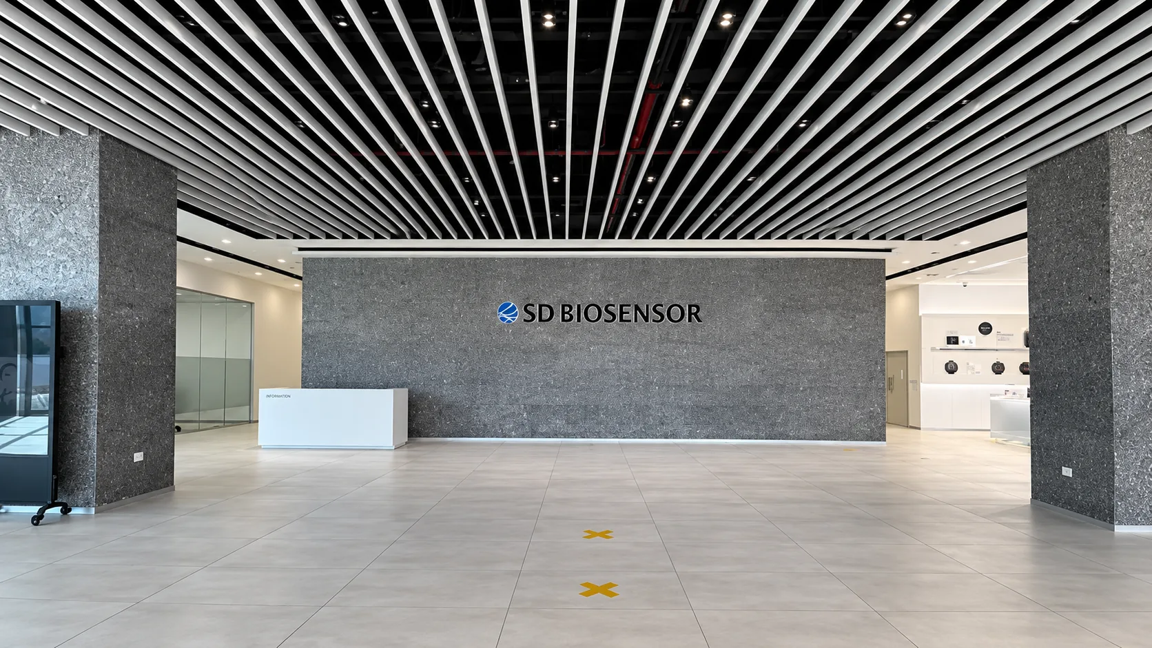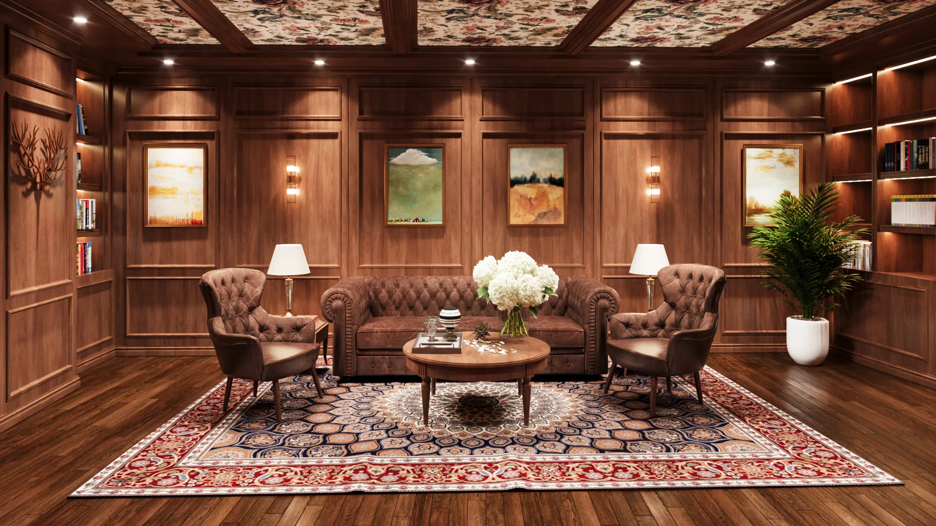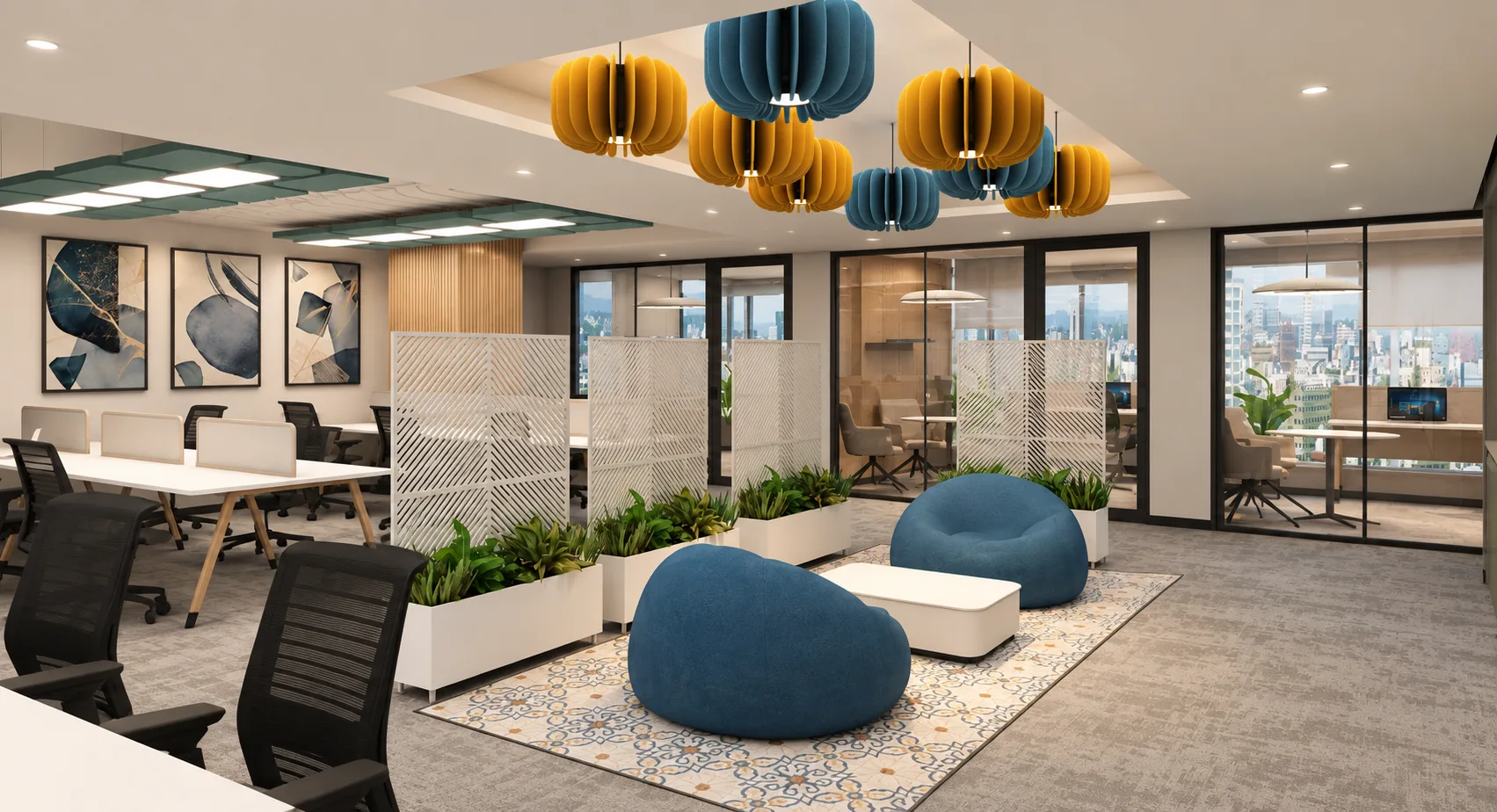
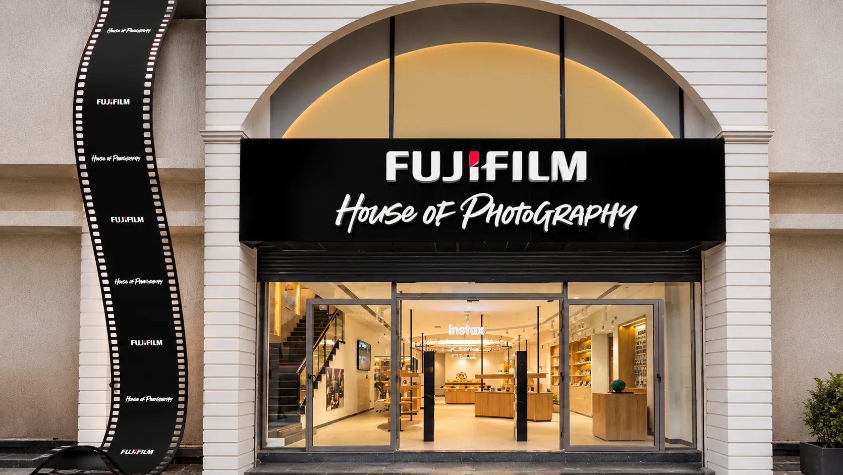
A retail interior has only a few moments to orient a visitor and make the next step feel natural. The journey begins before the door, continues through product discovery and service, and ends with a final impression at checkout or departure.
A coherent plan connects those moments without turning the store into a prescribed route. Customers should feel guided, not controlled.
Win the threshold
The storefront, first view and decompression zone should quickly explain where the customer has arrived and what is worth exploring. One confident focal point is usually more effective than several messages competing at once.
Keep the first steps clear. Give visitors enough room to adjust, understand the space and choose a direction before introducing dense product or detailed information.
Build a rhythm of discovery
Long sightlines provide orientation while nearer displays create moments of pause. Changes in scale, light, colour and fixture type can define categories without relying on excessive signage.
The plan should support different speeds. Some customers know exactly what they need; others want to browse, compare or ask for advice. Clear shortcuts and generous consultation points serve both.
Plan for products to change
Campaigns, launches and product ranges move faster than a fit-out cycle. Modular display components, adjustable lighting and accessible power allow the environment to change without losing its architectural identity.
Back-of-house storage, replenishment and staff movement should be tested alongside the display plan. A beautiful customer journey is easier to maintain when daily operations have an equally clear route.